

WNDR: Of Beauty and Inquiry is first and foremost, a tribute to the renowned graphic artist and typographer, Marian Bantjes. Boasting two full narratives consisting of Bantjes' 2010 TEDtalk, Intricate Beauty By Design, as well as "The Alphabet: A Critique," a chapter from her 2010 book, I Wonder, a book filled to the brim with designs, thoughts, and musings of the iconic designer. Marian Bantjes and her work are very dear to me for personal reasons—her art style has shaped my digital illustration style, and our similar design ideaologies inspired me to professionally pursue graphic design. The best part of being so inspired by Bantjes was the fact that I could stay true to her working philosophy of establishing something personal in approaching this book; making the approach more open-ended with plenty of possibilities. As a result, I wanted to combine my own illustration skills and love of pattern and research in both the physical copy and digital iteration of WNDR, in creating a tribute piece that is additionally interactive as reference my study of 25 individual type specimens as it does to honor the marvelous work of Marian Bantjes.

Initially, I became inspired by Cameron Moll's typographic series of posters, Structures in Type, which showcases well-known architecture such as the Roman Colosseum, Brooklyn Bridge, but drawn with the patterning of letters and symbols to create shades against the implied lines of the real-life structures.

Originally, I wanted to go back to my illustration roots and have my pictures to emulate the gestured figure drawings, but drawn with letterforms of its respective fonts. In a way, this was a pun on the word "typeface", as faces are drawn with letterforms of a specific font. Another Idea I had to approach WNDR: Of Beauty and Inquiry was to stylize it as a personal sketchbook; however, I scrapped the idea in favor of working more efficiently using a graphic style, and additionally focused on patternwork in the final book instead.
The first digital drafts of page layouts shows chapter opening pages, to the type specimens in addition to explorations of layout in the type specimen spreads. From early on in development, I dabbled with the idea of unique foldouts for the book to create a physical interactive element for the viewer's experience. Further, the inclusion of additional folding pages in the book was inspired by a segment in Bantjes' TEDtalk in which she shares with the audience her a calligraphic, tri-fold, anonymous love letter that she shares with friends per her personal tradtion of sending hand-made holiday and Valentines' cards.

For the final layout, I decided to use a two-column modular grid that also breaks off systematically for the square book. In addition, to create variety, I extended some text to an extra half measurement as according the grid columns for certain pages. I also chose to use a yellow, red, orange, purple color scheme as it resembles the sunset, a time of great contemplation for me and a wonder for all to witness it along the San Diego shoreline. In addition, rather than taking the illustrative elements of using the letterforms as a way to draw, I took the opportunity to create patterns and play with layer overlays instead after further research on Bantjes' design process.
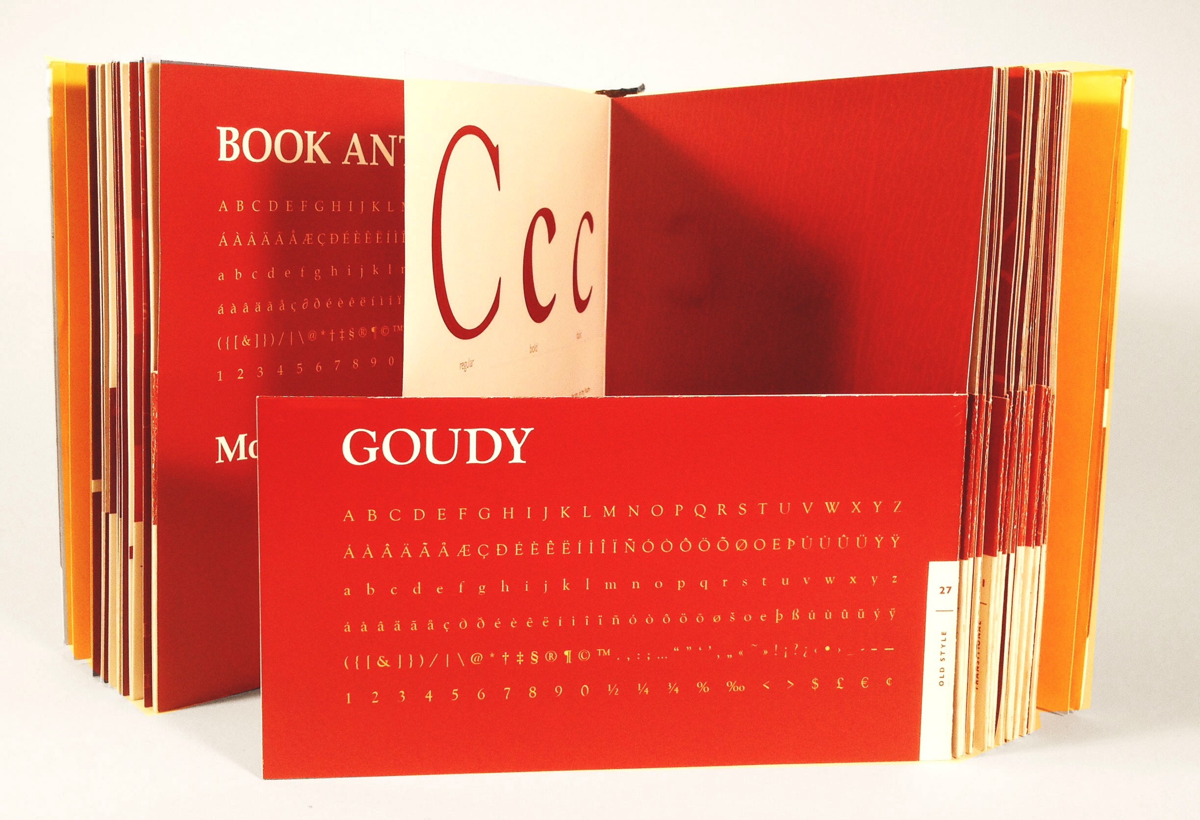
There 25 specimens shown in the book and in order, they are: Adobe Caslon Pro, Book Antiqua, Goudy Old Style, Palatino, Hiroshige, Baskerville, Bulmer, Cochin, New Aster, ITC Slimbach, Bodoni, Bauer Bodoni, Didot, Fenice, Monotype Modern, Clarendon, Rockwell, Joanna, Lubalin Graph, Chaparral Pro, Avenir, Futura, Century Gothic, Frutiger, and Univers.


As mentioned, WNDR: Of Beauty and Inquiry employs unique foldouts. Due to the specimen alpha-numeric showcase alternating as each letter in the alphabet is critiqued by Bantjes, every font specimen showcased on the right side contains the fold out, accompanied by a fullpattern page. This serves as a way to make the book more functional— with that specimen flaps can easily fold over other pages, and would allow the reader to effectively compare specimens with one another and experiment with font combinations within the 25 typefaces. As an added bonus, there is supplementary text within the section, "The Alphabet: A Critique" contained in a yellow that entails further information about the origin of the font itself.


A companion to the one-of-a-kind narrative + specimen book, WNDR: Of Beauty and Inquiry, the app WNDR aims to be an all-in-one resource, including an e-book of the physical text. WNDR also includes interactive references, links to the original font foundries for purchase, and a matching game to help users learn the 25 font specimens. Much like the word it derives from, WNDR is an app aims to compel the mind and stir curiosity for adults with great interests in design as well as Bantjes' work.


