

Gilded in gold. Rounded in its' simplicity. Ubiquitously tall and rectangular, yet small and square, the Colloquial Deco font family takes the eloquence of Art Deco and the attitude of the American Jazz Age to breathe life onto designs as a sans serif display font.
From the beginning, Colloquial Deco takes heavy inspiration from both the hand-drawn and unique logotypes on display of the small businesses lining El Cajon Boulevard in San Diego County—particularly the branding of local businesses such as Tire World and Honey Yoga as the letterforms are similarly geometric serif display fonts that convey a retro feel. The regular face of Colloquial Deco was initially created to be a marriage between the two logotypes, taking the high contrast strokes, flourishes, long rectangular counters, and tall capitals of Tire World, mixed with the rounded ends, and the small, quadratical lowercase forms of Honey Yoga. Using hand calligraphy techniques taught by accalimed Brazilian typographer and calligraphic artist, Yomar Augusto, many variations were created throughout the process of Colloquial Deco. Ultimately, to keep the final font family simple, only bold, italic, and thin faces were digitally translated and finalized on Adobe Illustrator, though creating unique variations such as cursive, lines, blocks, silhouettes, serif, and stud-like concepts were still an enjoyable and fun part of the process nonetheless.

Understandably, the beauty of creating a sans serif display font with heavy emphasis on simple shapes made the process of crafting each letter go more smoothly, as parts of each letter can be interchangeable, and extra flourishes can be added to give Colloquial Deco some extra flourished pizzazz.

The remaining faces of the font family are crafted to be distinct from the practice of simply slating the regular face to create the italics, or stretching the original to create the bold variant. For instance, italicized faces of Colloquial Deco follow the calligraphic rule in which italicized letterforms are created from one continuous stroke, and Colloquial Deco does its best to emulate the principle, given its sans serif form. Additionally, italic lowercases have its descenders created with cursive-like flourishes to distinguish them from their upright counterparts, and overall, select corner curves are more rounded to keep the italic faces dynamic. Both the bold and thin weights, on the other hand, simply double the thickness of the vertical strokes or thin the vertical strokes until they are uniform all over, respectively.

According to various dictionaries, colloquial language is casual and conversational: it's the difference between "What are you going to do?" and "Whatchagonnado?" The word colloquial comes from the Latin word colloquium, which means "speaking together." The roots are the prefix com-, which means "together," and the suffix -loqu, which means "speak." Similar to how some may think that colloquial language isn't good to use for all occasions, Colloquial Deco as a display font relies on the context it's used in. Much like it is acceptable to be colloquial and chatty with friends, it may not be wise to be colloquial and use the Colloquial Deco font family within an essay for school or work. Though for various design applications, the Colloquial Deco font family may be paired within each other or with an appropriate, geometric sans serif font such as Univers, Gotham, or Futura for contrast.

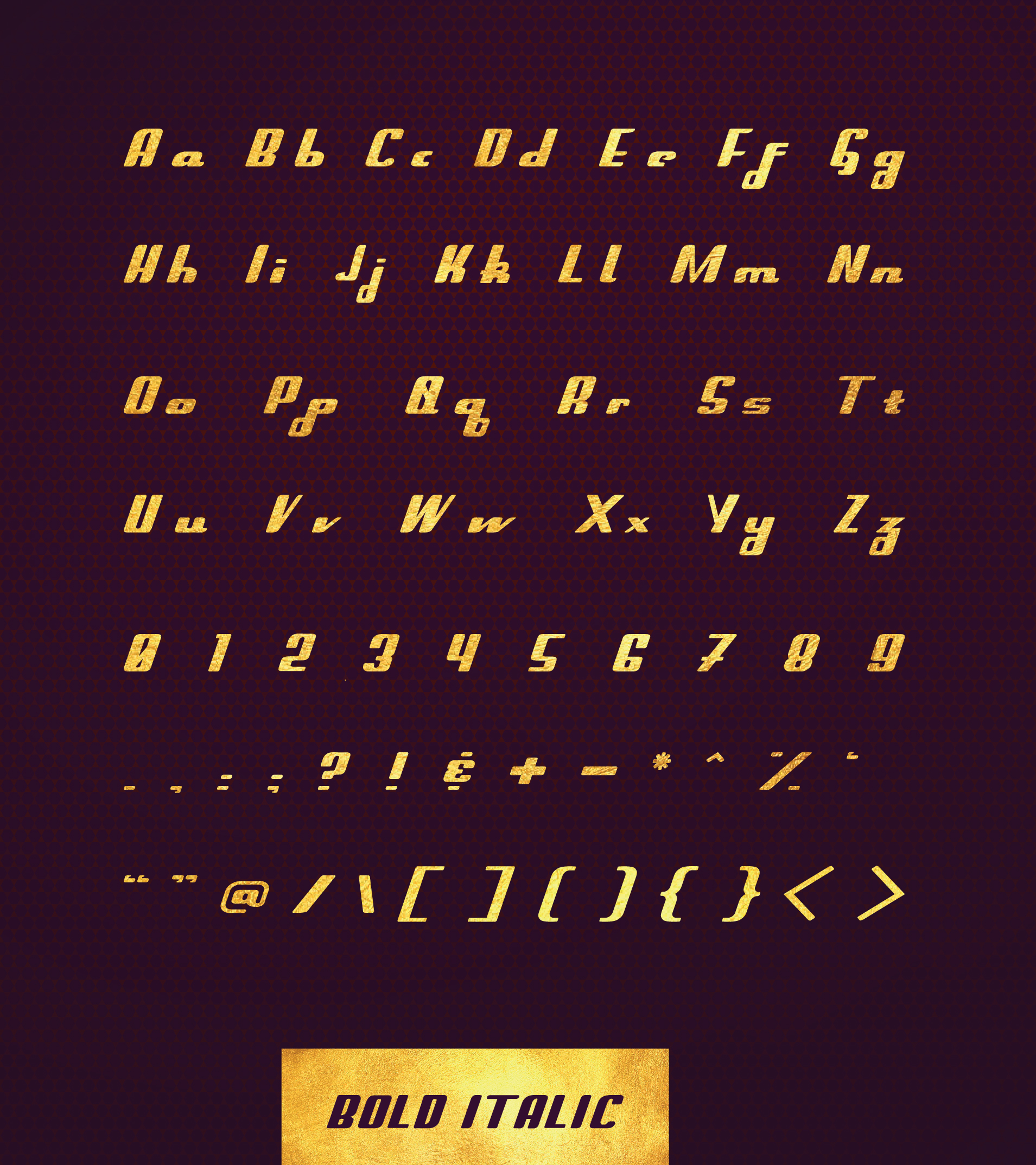
The Colloquial Deco font family consists of six weights: regular, italic, bold, bold italic, thin, and thin italic, each with 90 characters. Additionally, Colloquial Deco presents unique forms of the letters: G, Q, e, f, t, and z, and the numbers 0 and 7, with cursive and serif influences atypical of sans serif fonts.


To showcase the font, the typeface was created into a screen printed series of posters in collaboration with the SDSU Screen Printing Studio and Professor Scott Wyss. Taking Colloquial Deco's regular weight, each letterform together create an abstract and an equally captivating composition in its' boldness, further highlighted by the gold, water-based ink on textured, colored illustration paper.


