With transmitting, receiving, and exchanging ideas, it is well-established that communication is an important part of life. Within the study of communication, there is a pervailing belief in the community that within in our lifetimes, we as humans will innately convey our ideas more non-verbally than verbally. It is with fascination of this belief that Every Body Talks will focus on the importance of our body language; and how the nuances of facial expressions, gestures, posture, gaze, body contact, and positioning further affect how we interact with, perceive, and ultimately understand one another.


During poster development, it was apparent that the very first poster wireframe was the strongest layout of the three. From that layout, it was further streamlined by cleaning up the grid and adding filled in color containers in the background to add contrast. From the beginning, Every Body Talks is meant to cater to everyone as body language is an ability that we all pick up on. With that in mind, I chose to first work in shades of a sky blue as it’s a color or productivity that can cater for a professional or general feel, and in monochromatic hues to accent to help me with contrast and to help keep it simple in this initial stage.

Taking note of the various critiques, I set to make a more dynamic poster by creating a new layout, working with a brighter, more uplifting color palette, and incorporating an illustrative pattern alongside revised graphic models. From the critiques, I learned that the stronger elements of the rough drafts were the sectioning of information off to the left side, in addition to including a whimsical title.

By removing the white gaps and converting the left section of the poster into a long bar, it makes it easier to organize the introductory data on communication and works to draw the viewer’s eye as per the western reading convention of naturally reading left to right. Then the information on the right side of the poster would follow after, descending all the way toward the bottom quote. The inclusion of the map is intended to create variety in scaling and dynamic hierarchy. The final elements of the color palette, layout, type setting, and playful theme established in this poster dictates the style in the accompanying magazine spreads, and interactive app.

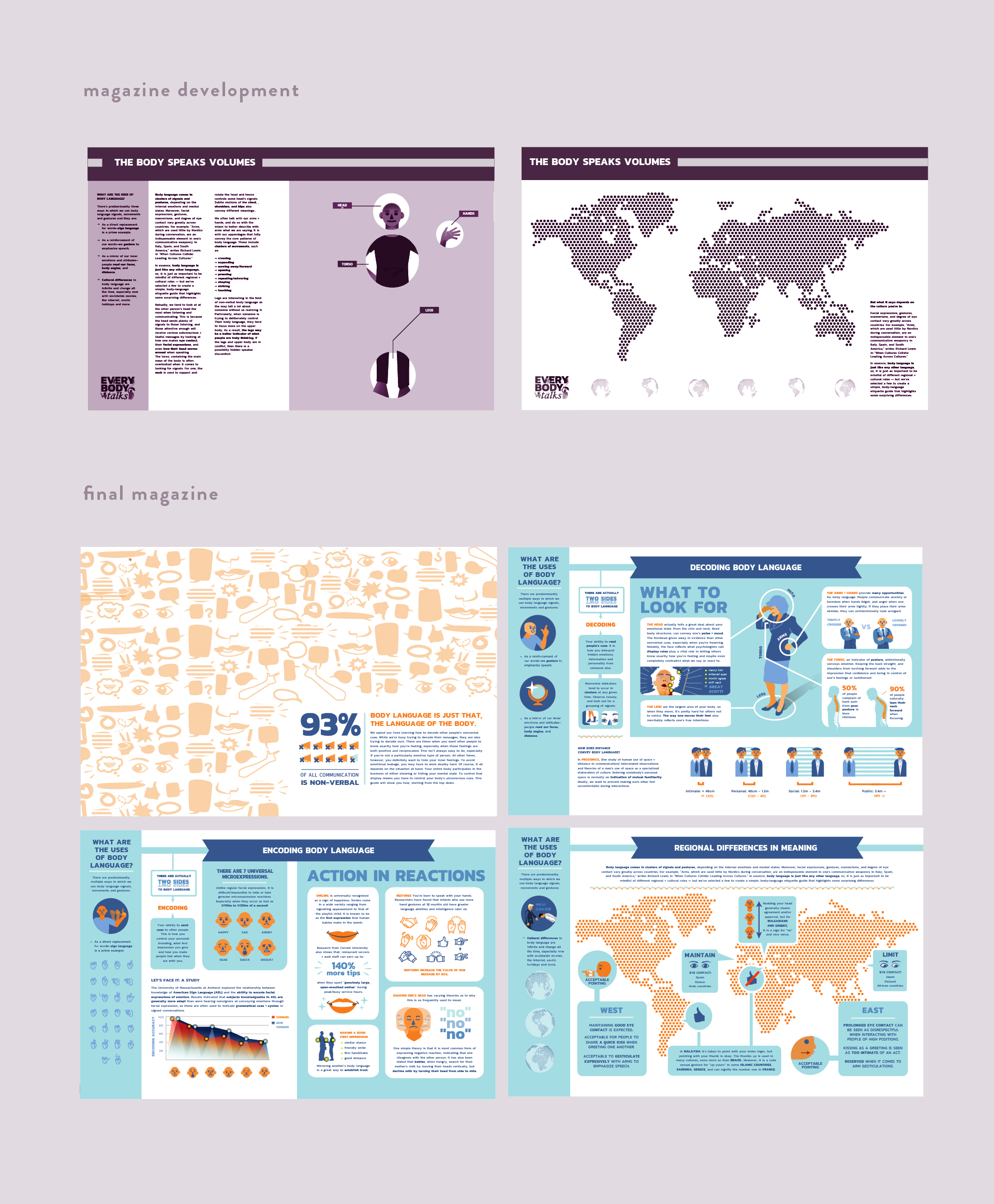
Taking the final aesthetic established from the poster, magazine wireframes maintained the idea of a left section separating more generic side information from the rest of the section throughout the spreads. With all the data gathered, the magazine spreads were my chance to go in depth in topics that I could not do with the poster. The challenge of working with a nontraditional magazine spread was the greater focus toward highlighting the graphic models and diagrams from research. At one point, my magazine spreads were too text heavy, and after plenty of adjustments, the design finally had attained a good balance of content in relation to graphic models compared to the original layouts throughout development.


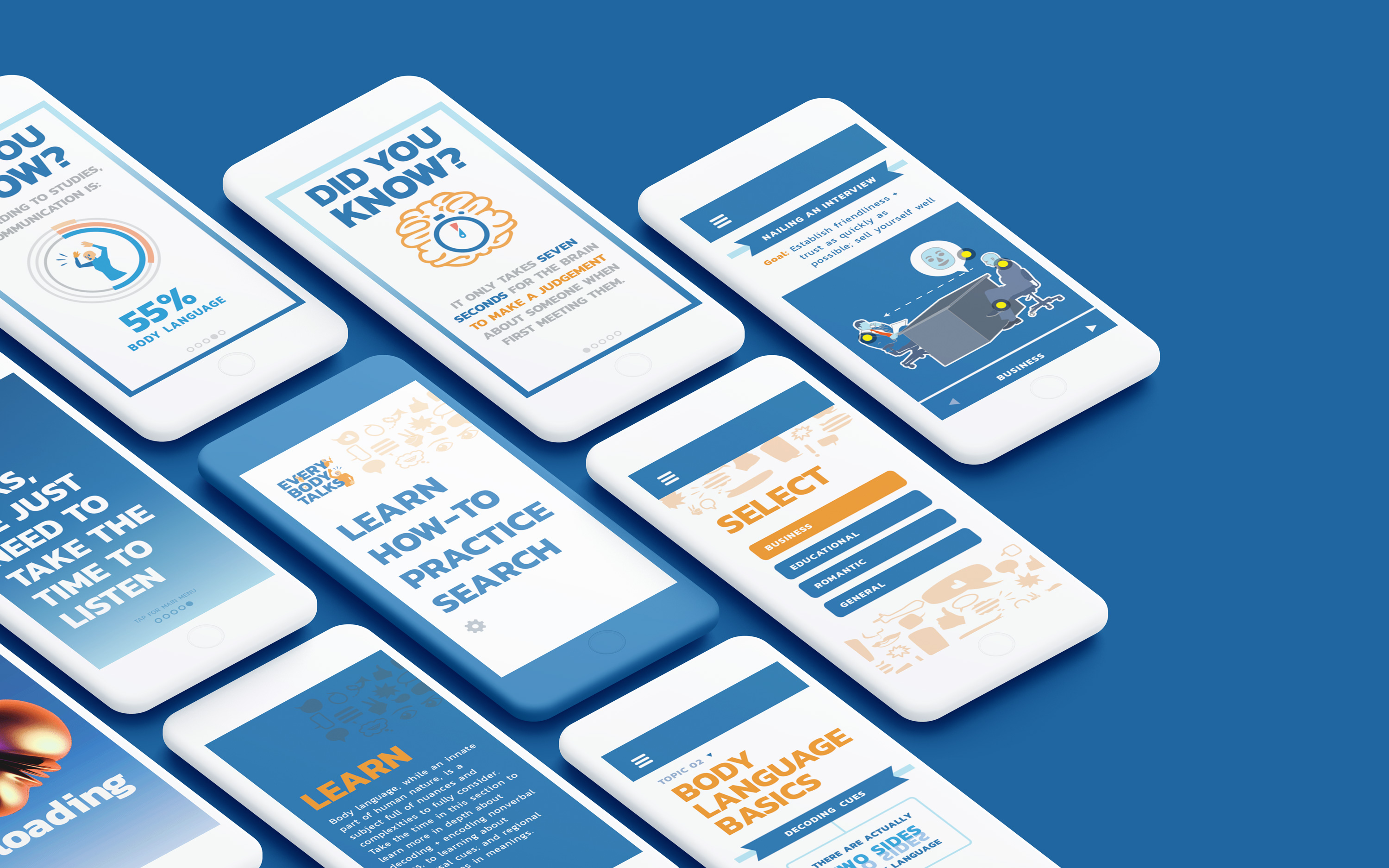
The app, Every Body Talks, is designed to be an informational resource app to help users learn more with body language made with teens to adults in mind. I created the app as a compendium for body language and nonverbal communication—featuring a complete electronic version of my magazine spreads, as well as an instructional "How-To" section interactively guiding users through professional, educational, romantic, and general scenarios to help them build confidence and understand how to apply body language. In addition, there is an extra feature of the app that would ideally take advantage of the smartphone’s camera, and it would function to similar social media apps such as Instagram and Snapchat in how it can incorporate filters with facial morphs and video prompts to help users observe how their own body language, and practice for scenarios in a fun, lighthearted way.